Tom Dunne
Product Designer
Laundrylux
A leading provider of commercial laundry solutions, embarked on a comprehensive rebranding journey to refresh its identity,
enhance its market presence, and streamline its communication strategy across digital and print platforms. This case study outlines the complete rebranding process, executed by
a dedicated team of creatives working under the direction of a lead strategist and myself as a senior designer.
The project, spanning a 12 month period involved a holistic approach to brand integration, positioning, and the strategic
rollout of new and existing brand elements across various physical and digital media.
Role: Design Director
Tools: Figma, Illustrator, After Effects, Photoshop, InDesign, WordPress, Premiere Pro, Asana
Deliverables: Branding, UI/UX Design, marketing and print collateral, iconography, visual assets, social media and blog posts, motion and interaction design, web design and development, trade show design
Brand Identity
The rebranding initiative for Laundrylux was driven by the need to modernize the company's image and align its visual identity with its innovative approach to commercial
laundry solutions. Key objectives included:
Brand Integration and Positioning: Establishing a cohesive brand identity that resonates across all touchpoints, from internal communications to
customer-facing materials.
Digital and Print Implementation: Ensuring that the new brand is consistently represented across all digital and print assets, including logo design,
stationery, brochures, email campaigns, social media ads, and web design.
Creative Direction: Leading the creative vision for the brand, including art direction for video projects, exhibition planning, and artwork production.
Brand Strategy and Positioning
Market Research: The rebranding process began with an in-depth analysis of the commercial laundry industry,
competitor brands, and customer perceptions of Laundrylux. Insights from this research informed the strategic
direction for the new brand identity.
Brand Messaging: A clear brand narrative was developed to communicate Laundrylux’s commitment to innovation,
quality, and customer service. The messaging was crafted to appeal to a diverse audience, including laundromat
owners, hotels, and healthcare facilities.
Positioning Statement: The brand was positioned as a leader in the commercial laundry industry, offering
advanced technology, reliable & educational service, and a customer-centric approach.

Visual Identity Development
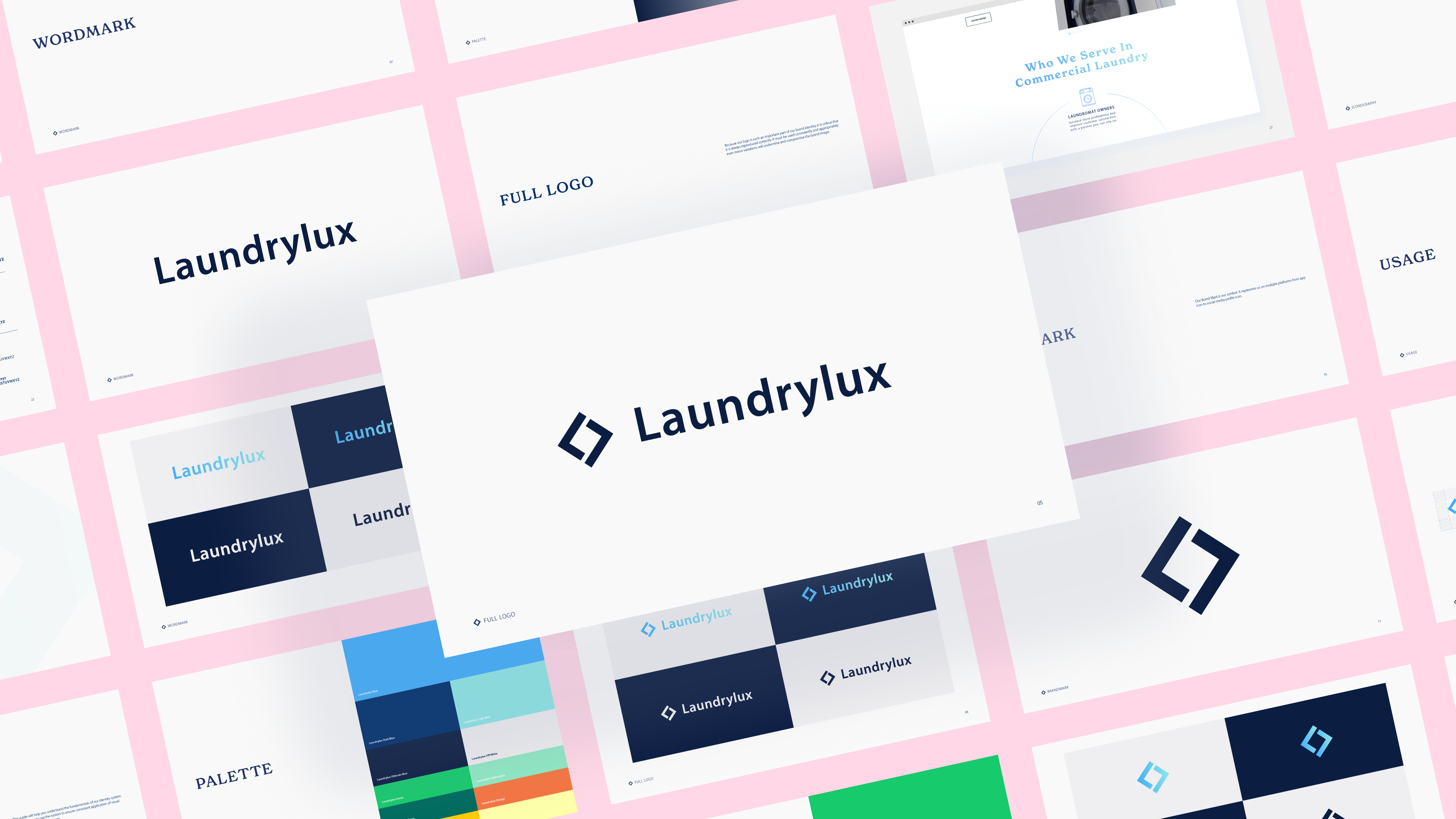
Logo Design: The rebranding included the creation of a new logo that reflects the modern, forward-thinking
ethos of Laundrylux. The logo was designed to be versatile, scalable, and instantly recognizable across all mediums.
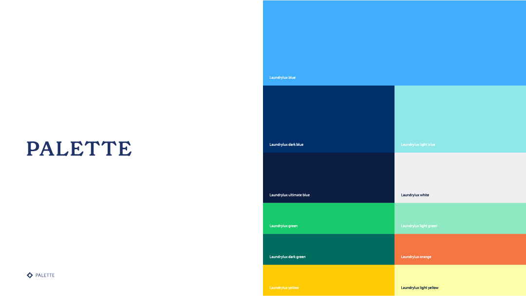
Color Palette and Typography: A new color palette was introduced to evoke trust, professionalism, and innovation.
Complementary typography was selected to enhance readability and reinforce the brand's identity.
Brand Guidelines: Comprehensive brand guidelines were developed to ensure consistency in the use of the new
visual identity across all platforms. This included specifications for logo usage, color schemes, typography, and design of
a custom iconography set.
Digital and Print Implementation
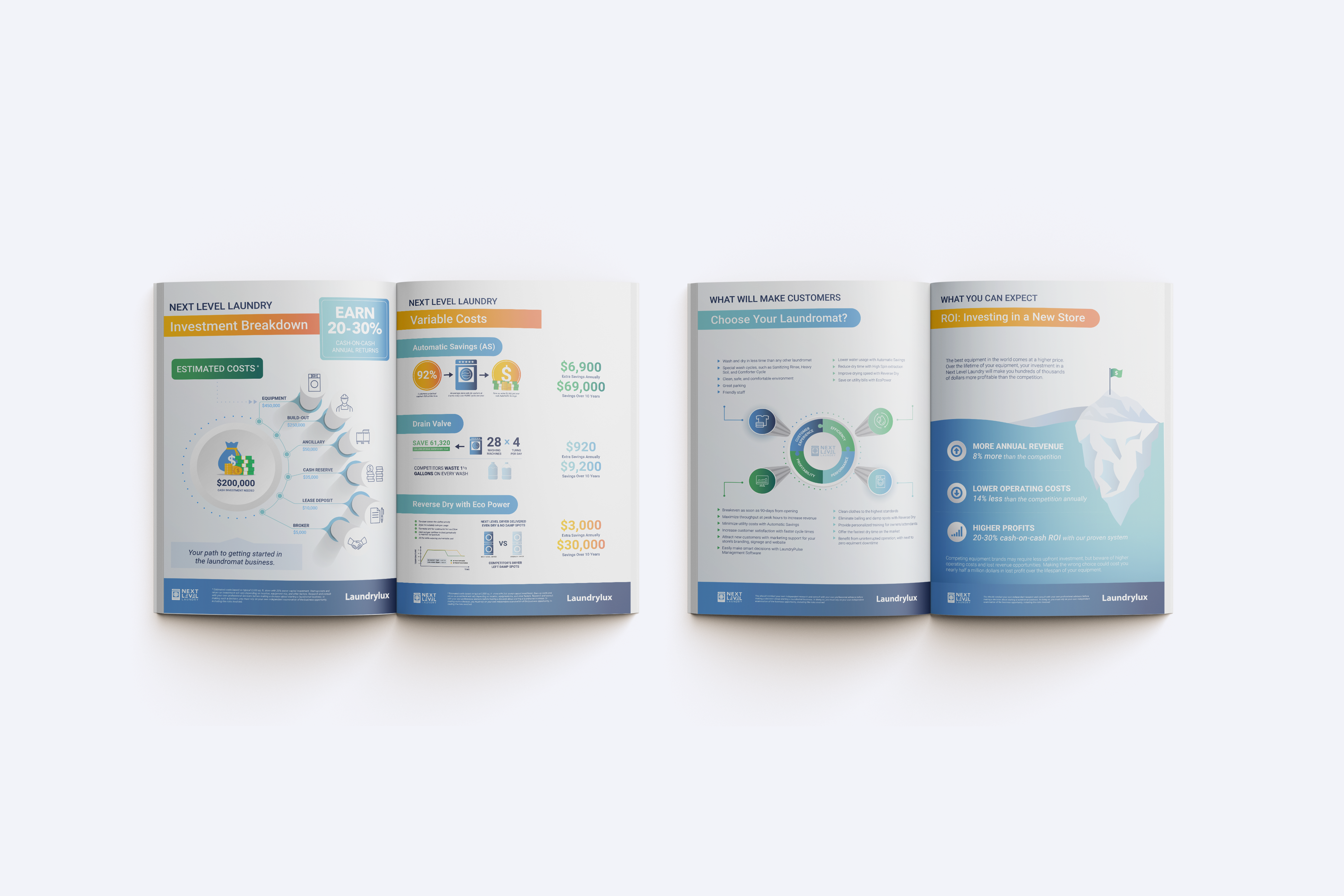
Stationery and Brochures: The rebrand extended to the redesign of all stationery items, including
business cards, letterheads, and envelopes, as well as marketing brochures. These materials were designed
to reflect the new brand identity while effectively communicating key information to clients and partners.
Email Campaigns and Social Media Ads: A series of email campaigns and social media advertisements were
launched to introduce the new brand to existing customers and attract new prospects. These campaigns were
designed to be visually engaging and aligned with the overall brand strategy.
Web Design and Development: The Laundrylux website underwent a complete redesign, incorporating the
new visual identity and enhanced user experience. The website was developed with a focus on responsiveness, easy
navigation, and clear communication of the company's offerings.
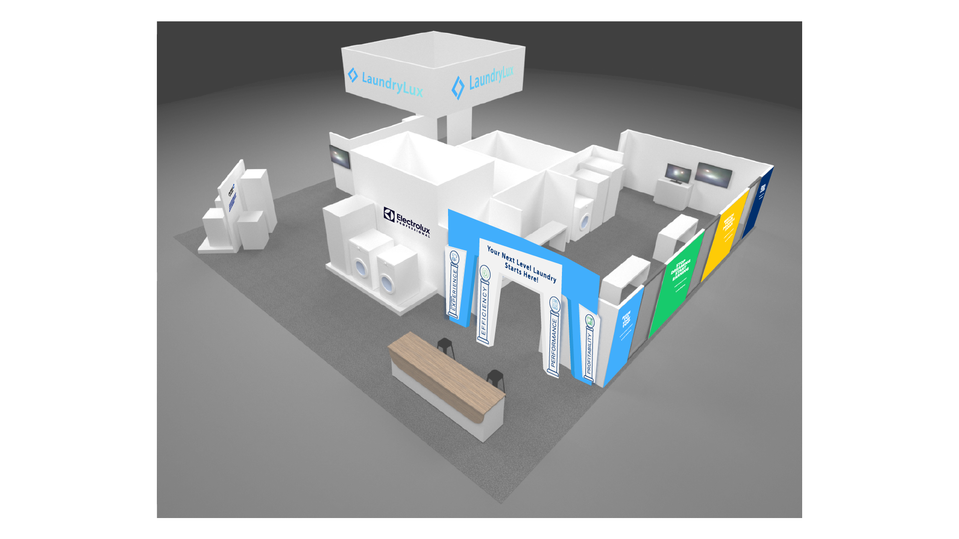
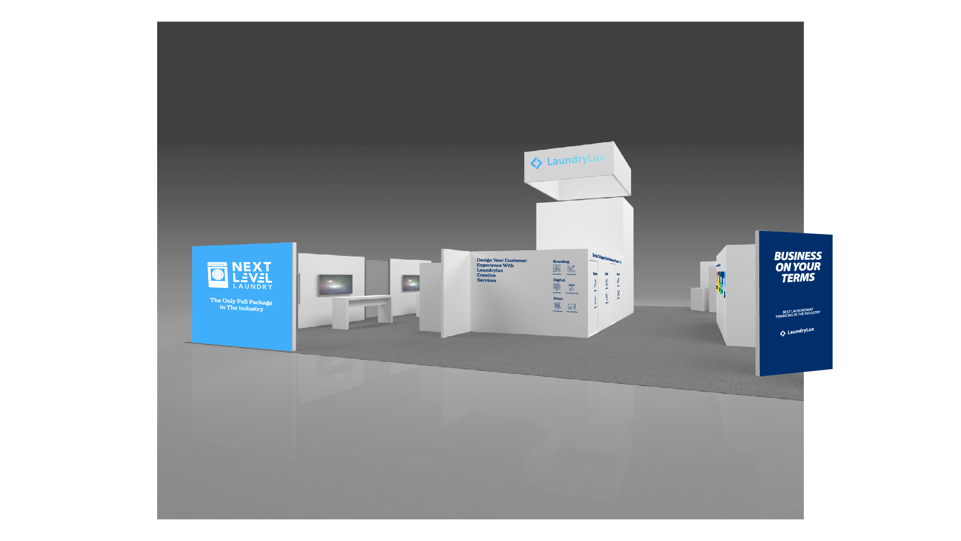
Exhibition Planning and Artwork Production
Exhibition Design: The rebranding project also included the planning and design of exhibition booths and
displays for industry events. These exhibitions were designed to showcase the new brand identity and attract attention
in a competitive environment.
Artwork Production: Custom artwork was produced for various marketing materials, including print ads, banners,
and digital graphics for both internal and external uses. This artwork was designed to be consistent with the new visual
identity and effectively communicate the brand's message.
Conclusion
The comprehensive rebranding of Laundrylux was a significant undertaking that involved the coordination of a multi-disciplinary
team and the integration of new brand elements across a wide range of platforms.
By focusing on strategic brand positioning,
consistent implementation, and creative direction, the rebrand successfully revitalized Laundrylux’s identity, positioning
the company for continued growth and success in the commercial laundry sector.