Tom Dunne
Product Designer
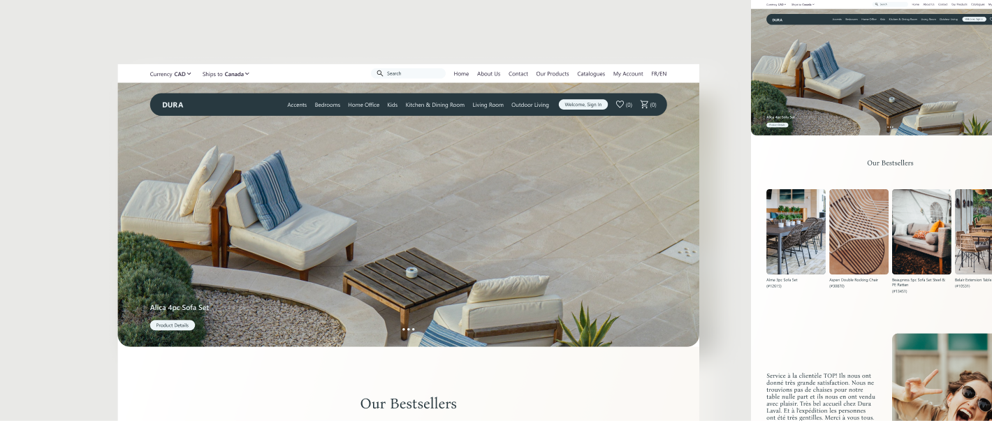
Dura Housewares
Responsive e-commerce web design & brand overhaul for a local, family run, Montréal furniture store looking to increase sales through their digital presence and aligning their new brand identity with heightened customer expectations and social impact.
View usability docs on Notion
Role: Lead UX Designer
Tools: Figma, Illustrator, After Effects, Photoshop
Deliverables: User research, competitive analysis, wireframes, mockups, interactive prototypes, usability testing, responsive design system and web design.
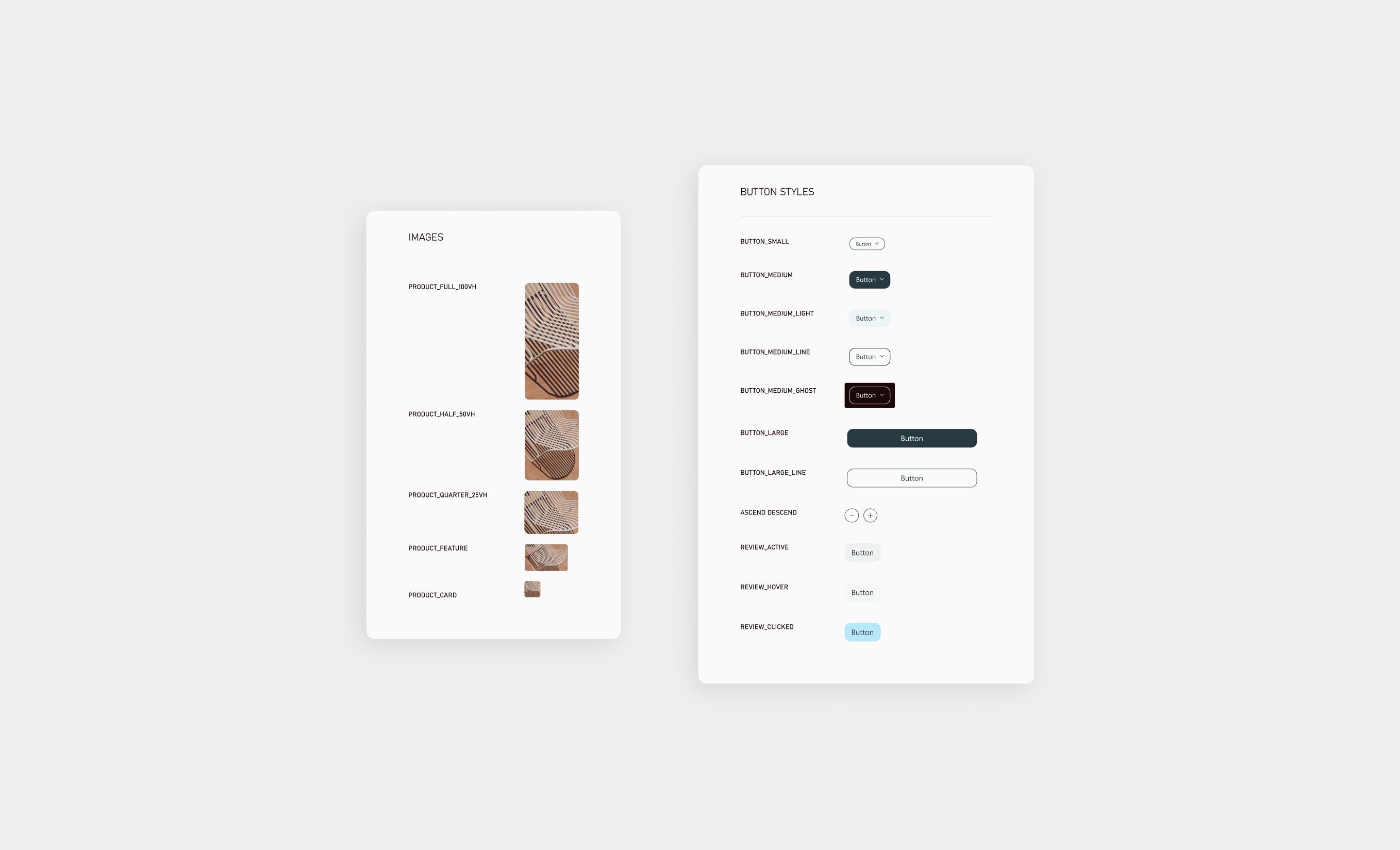
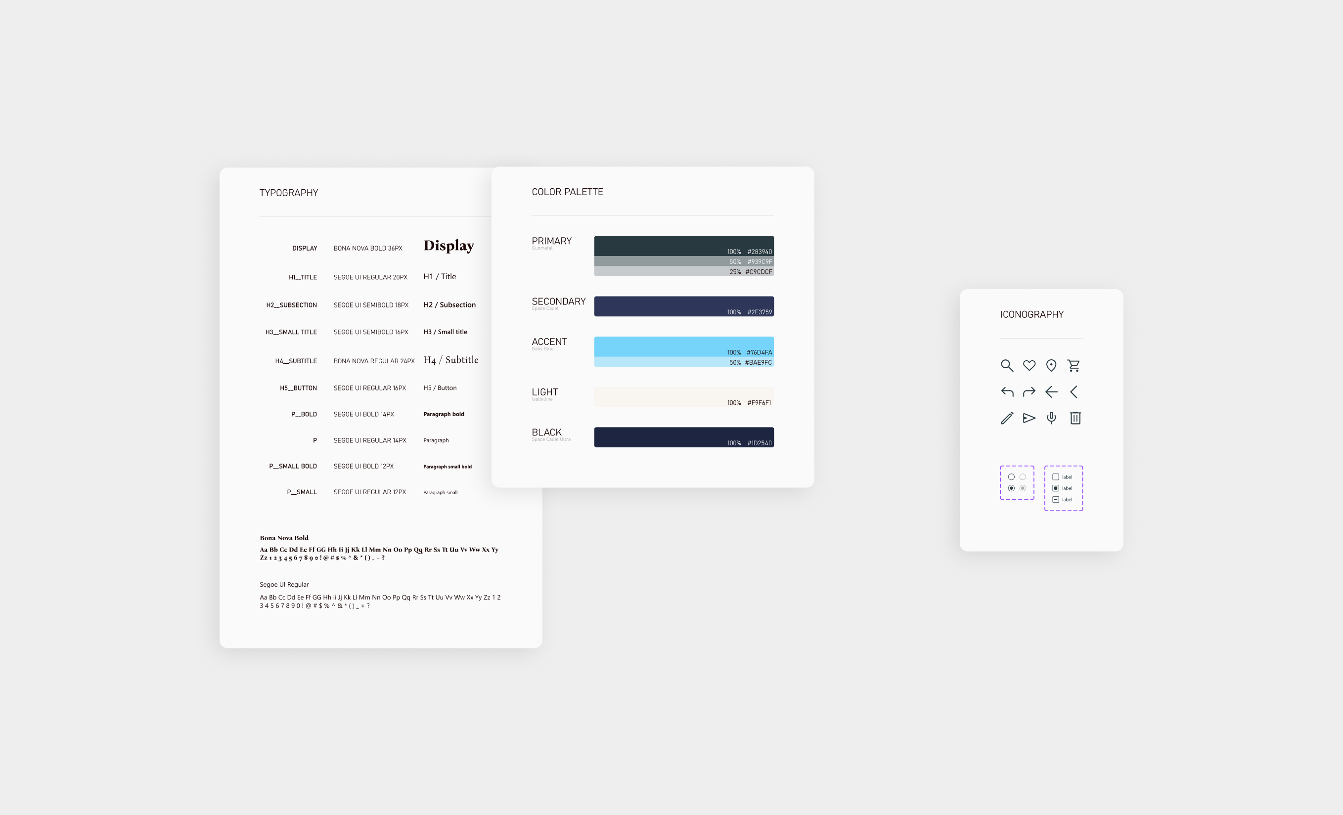
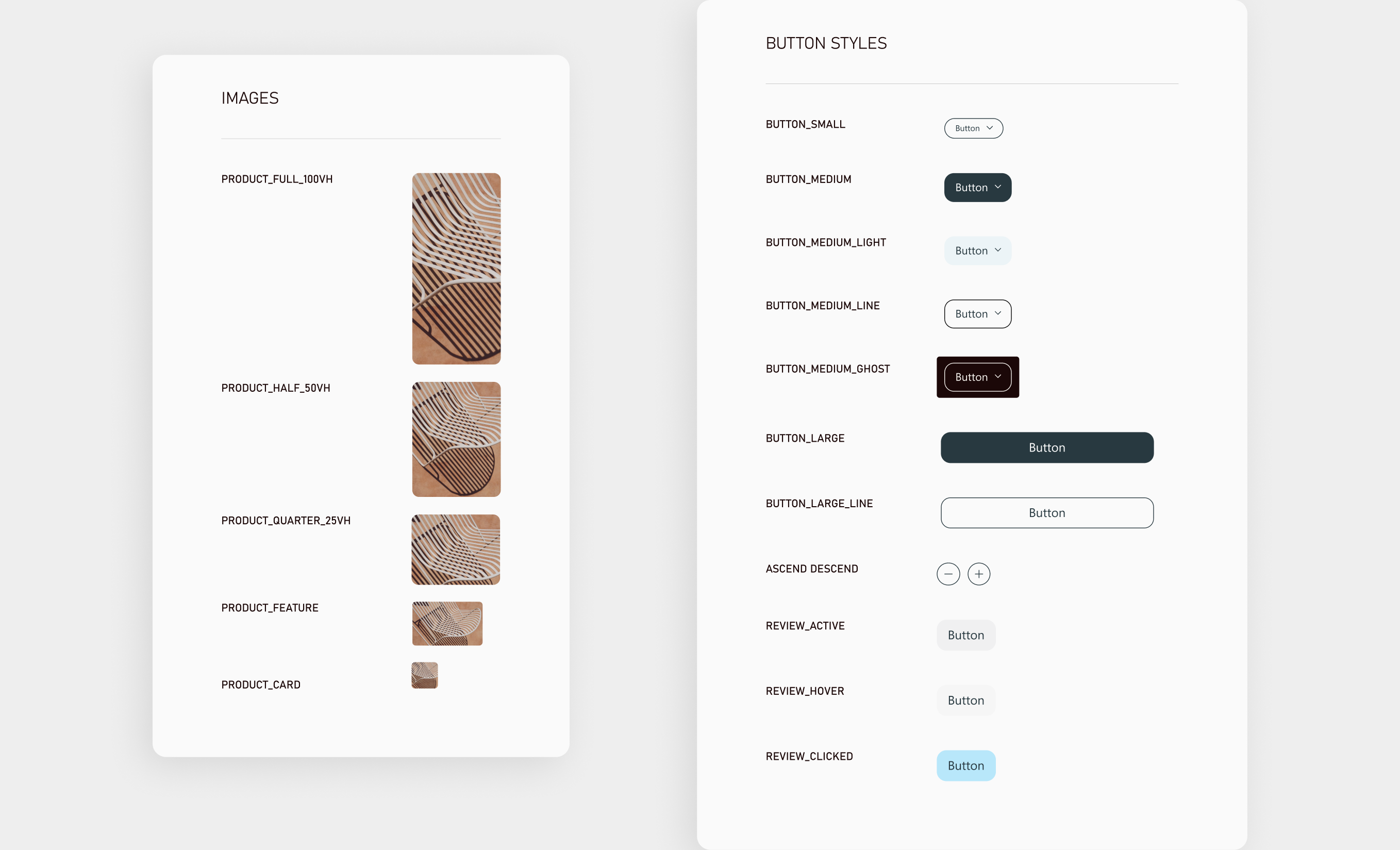
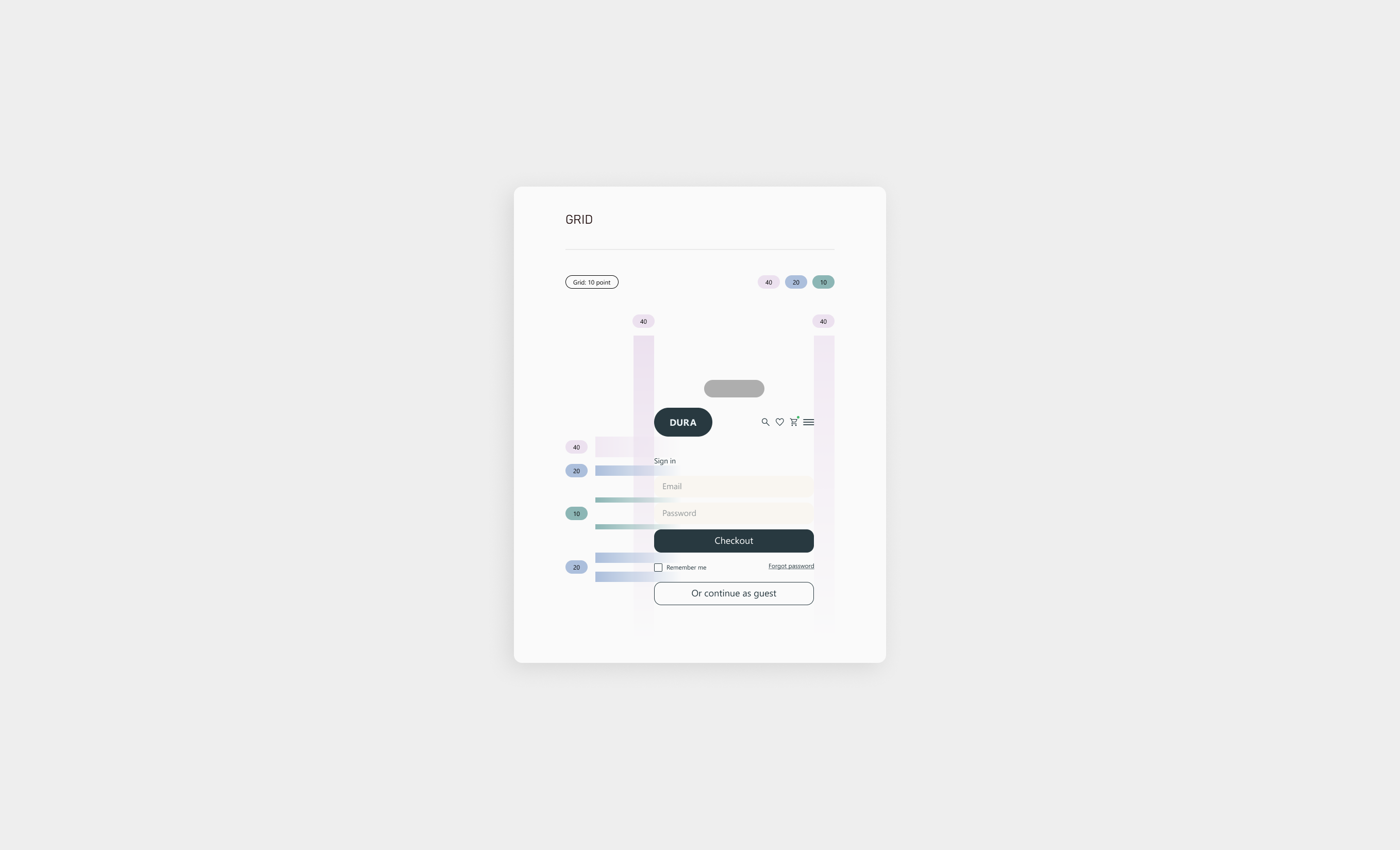
Design System
A robust design system was implemented early and continuously adapted as further iterations were made.
This gave time for client feedback and to utilize usability testing to ensure the system is easily reusable,
consistent and scalable, with any feedback taken into consideration for changes to be made with each progress
update biweekly.
The display typeface and accent color had some changes from initial variations but were easily
updated with global changes to be applied to multiple components with correctly setup text styles.
The small icon set needed was geometrically based on Material Symbols but designed with softer corners,
edges, and caps to employ a feeling of comfort in the product.
Design Process
The design process allowed us to create a responsive website, mobile first with the understanding that it can easily scale up
using auto layout to a desktop version through development using flexbox.
Having a working knowledge of front-end coding also
enabled me to implement design decisions achievable within the product, including interaction and animation limitations
& capabilities and keeping load times lightweight and fast.
I could then showcase high fidelity mockups with the client and begin
short usability sessions with simple prototypes.